Hey there, data nerds! I’m Tuan, and today, we’re diving into an important question in the world of data visualization: Do all dashboards need to be treated the same? The answer is a resounding no! While the overarching goal of dashboards is to provide insights and facilitate decision-making, different types of dashboards serve various purposes and audiences. Here’s a closer look at why one size does not fit all when it comes to dashboard design.
1. Understand the Purpose
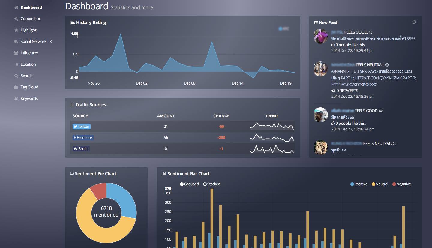
Dashboards can be categorized based on their intended purpose. Here are three common types:
- Operational Dashboards: These are designed for real-time monitoring of operations, displaying key performance indicators (KPIs) and metrics that require immediate attention. Their focus is on daily activities, so they should be easy to interpret at a glance.
- Strategic Dashboards: These dashboards are aimed at higher-level executives and focus on long-term goals and performance trends. They often incorporate a broader range of data and visualizations, emphasizing strategic initiatives and company objectives.
- Analytical Dashboards: Used primarily by data analysts and researchers, these dashboards facilitate deeper exploration of data. They typically offer more complex visualizations and tools for drilling down into specifics, allowing users to conduct thorough analyses.
2. Tailor to the Audience
Different audiences require different levels of detail and complexity. For instance:
- Executives: They often prefer high-level insights and a clear overview of key metrics. Avoid overwhelming them with intricate details or technical jargon.
- Operational Staff: They may benefit from real-time data and specific metrics related to daily tasks. Make it straightforward so they can quickly act on the information.
- Data Analysts: They will want access to raw data and more complex visualizations. Providing tools for deeper analysis is crucial for this audience.
3. Choose Appropriate Visualizations
The choice of visualizations can greatly affect how information is interpreted. For example:
- Bar and line charts are effective for showing trends over time and comparisons between categories.
- Pie charts can illustrate parts of a whole, but should be used sparingly, as they can be difficult to interpret when there are too many categories.
- Heat maps can highlight areas of high and low performance, which is particularly useful in operational dashboards.
Selecting the right visualization depends on the data being presented and the audience’s needs.
4. Consider Frequency of Updates
The frequency with which a dashboard is updated also varies by type:
- Real-Time Dashboards: Ideal for monitoring ongoing activities, they require frequent updates and may include live data feeds.
- Periodic Dashboards: Strategic dashboards may only need to be updated weekly, monthly, or quarterly, reflecting longer-term trends.
Understanding the update frequency helps you determine what data is essential to include and how it should be presented.
5. User Experience Matters
User experience (UX) plays a critical role in dashboard design. Considerations include:
- Navigation: Ensure that users can easily find the information they need. A clean, intuitive layout enhances usability.
- Responsiveness: Dashboards should be optimized for various devices, including desktops, tablets, and mobile phones, to accommodate users who may access data on different platforms.
- Accessibility: Make sure that all users, including those with disabilities, can access and understand the dashboard. Use appropriate color contrasts and font sizes, and provide alternative text for visual elements.
Bottom Line
Not all dashboards should be treated the same. The purpose of the dashboard, the audience’s needs, appropriate visualizations, update frequency, and user experience all play vital roles in the design process. By recognizing these differences, you can create dashboards that effectively communicate insights and empower users to make informed decisions. Remember, the ultimate goal is to deliver clarity and actionable information tailored to the unique needs of your audience!